Design Brief
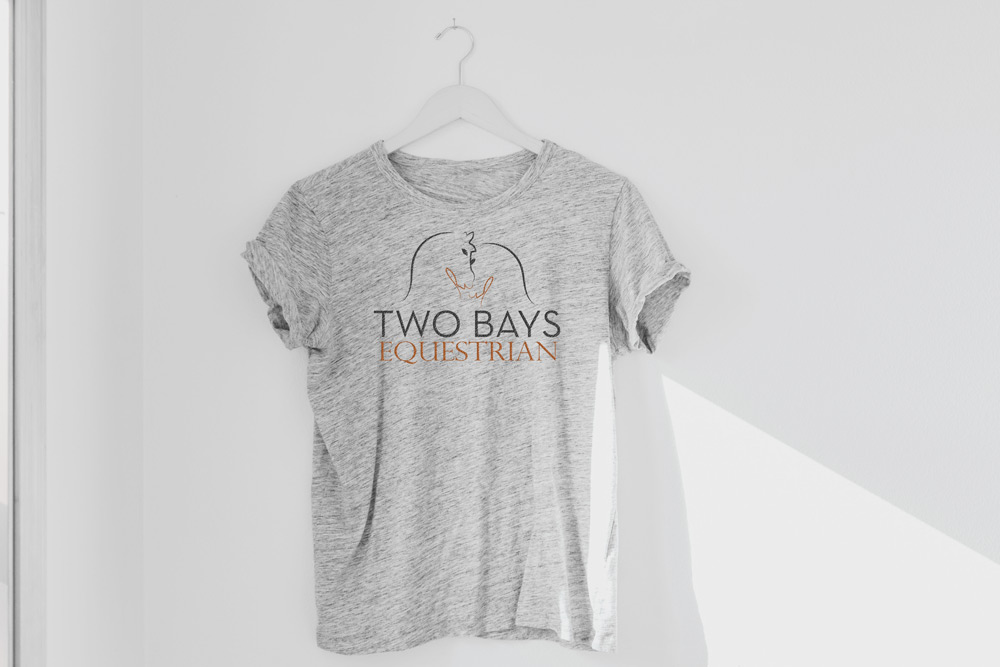
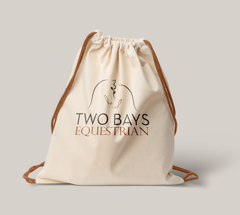
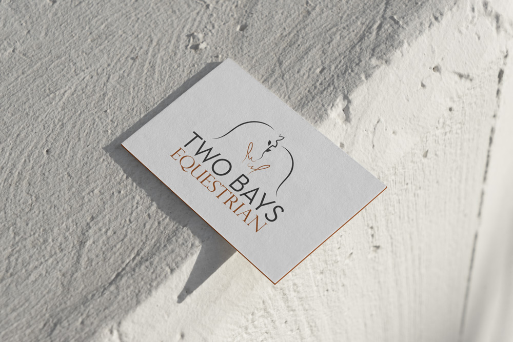
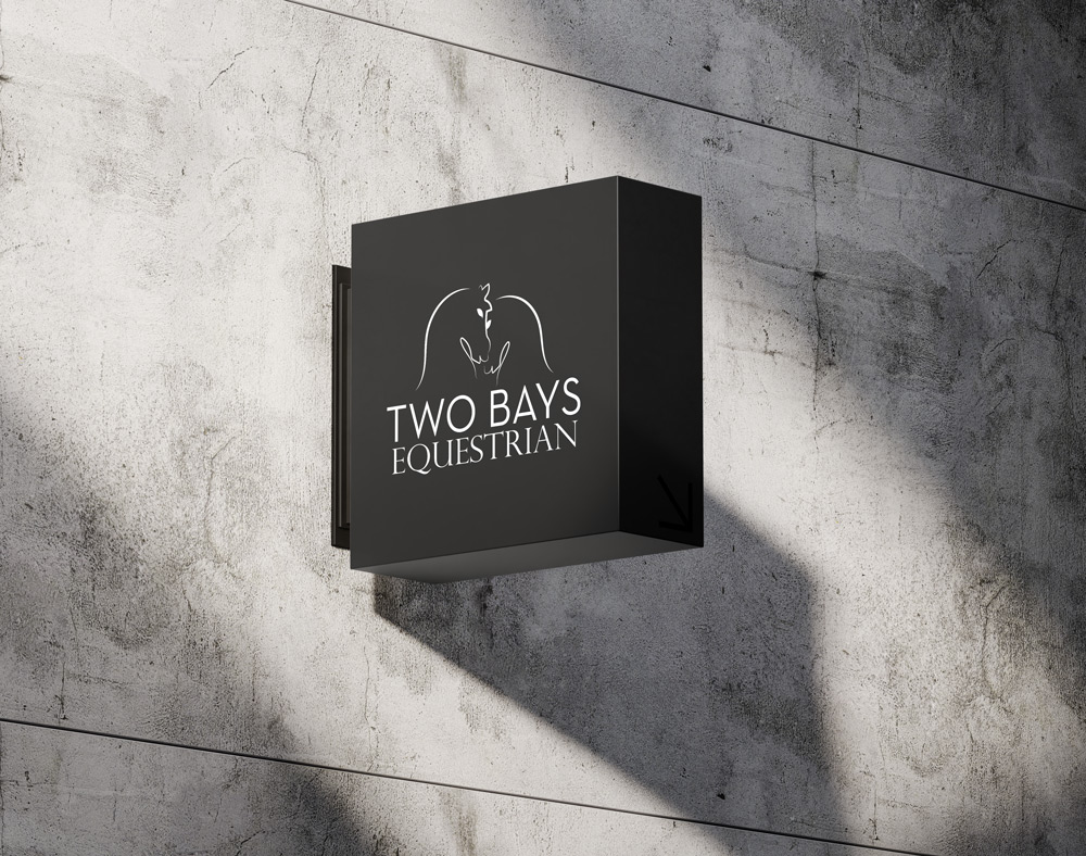
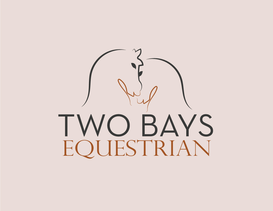
"Two Bays Equestrian" is a horse care company seeking a logo that simply and effectively reflects its name. The owner desired a cool and friendly illustration featuring two horses. The logo should be organic, not geometric, to convey a natural and approachable feel. The goal is to create a design that is both simple and inviting.
Elegant
Organic
Inviting
Simple



Initial Tracing
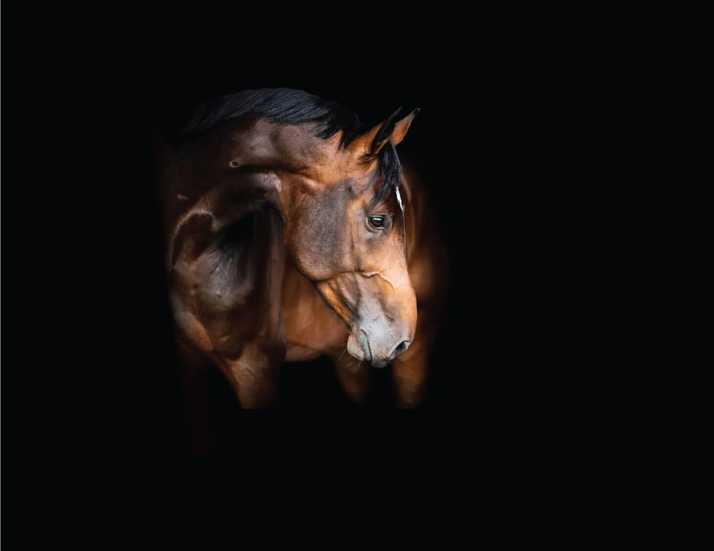
I started by tracing the horse's head in Illustrator, using a horse head picture as a reference.
Font Selection
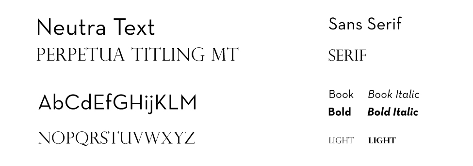
I chose an all-caps sans-serif font for the logo name.
Feedback
I demonstrated the first logo version to the company owner.
Simplification
The owner requested fewer horse body details and a different font combination for the name.
Refinement
I simplified the design, creating a more straightforward and harmonious look.
Adjustments
I adjusted the strokes and line style to enhance the logo's attractiveness.
Hey! I’m Chaker Saaf, a senior graphic designer from Tunisia with over 15 years of experience. Certified in multimedia arts, I've worked as a freelancer and with various offshore agencies.
I’m skilled in Adobe Creative Suite (Illustrator, Photoshop, InDesign, Premiere) and use AI tools to enhance my graphic design process whenever possible.
I love creating eye-catching designs that tell a story and make brands stand out. Check out my portfolio to see my work! You can also view my CV for more details about my experience.
Eager to bring my creative skills to an international stage, I'm excited about the opportunity to work abroad and collaborate with diverse teams.
Eager to bring my creative skills to an international stage, I'm excited about the opportunity to work abroad and collaborate with diverse teams.
Let’s Get in Touch!
Let’s Get in Touch!
© 2024 ChakerSaaf.com


